A business capability map is a single picture of everything an organisation does — the stable foundation for planning, assessment and investment decisions.

A business capability map is a structured picture of what an organisation does — not how it does it, not who does it, and not which systems support it. "Order Management" is a capability. "The order management team" is an organisational unit. "SAP" is an application. Keeping those three apart is most of the skill.
The value of the map is that it is stable. Reorganisations happen every couple of years and systems get replaced every five to ten, but the set of things a business fundamentally does changes slowly. That stability makes the capability map the natural backbone for assessment, investment planning and application rationalisation.
| Concept | Answers | Example | Changes |
|---|---|---|---|
| Capability | What we do | Customer Onboarding | Rarely |
| Process | How we do it, in what order | KYC check → credit decision → account creation | Often |
| Function / org unit | Who does it | Onboarding Operations, Bangalore | Every reorg |
| Application | What supports it | Salesforce, Onfido | Every few years |
The single most common failure is a map that mirrors the org chart. If your top-level domains are Sales, Marketing, Finance, HR and IT, you have drawn the organisation, not its capabilities — and the map will need redrawing the moment someone merges two departments.
Capability maps decompose into levels. Level 1 is a handful of domains. Level 2 is typically 30 to 60 capabilities and is where most useful work happens. Level 3 breaks those down further and is worth doing only for the areas you are actively working on.
The practical test: a capability is at the right level of detail if it could plausibly be owned by one person and assessed on its own. If it is so broad that its owner would be a board member, go deeper. If it is so narrow that it describes a single task, come back up.
Resist going to level 3 across the board. A 40-capability map you can assess in a fortnight is worth vastly more than a 300-capability map you will never finish.
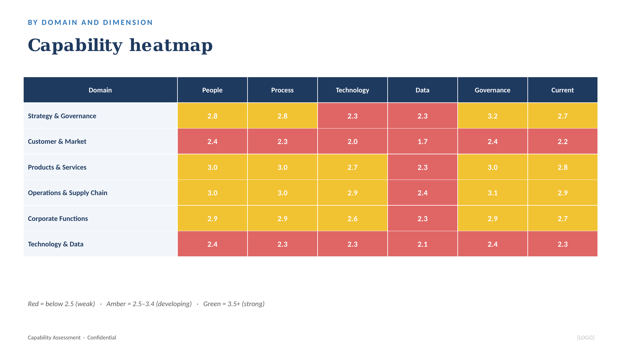
A heat map is a capability map with a colour overlay expressing some judgement about each capability. The map shows structure; the heat shows where to look. What you overlay depends on the question:
Keep the colour convention conventional: red is bad, green is good, and use a single hue's intensity rather than a rainbow. Never overlay two dimensions on one map with two different colour schemes — nobody can read it. If you need to show maturity and importance, use two maps side by side, or plot them on a matrix instead.
The map becomes useful the moment something is laid over it. Score maturity against it and you have an investment case — see the capability maturity model. Map applications to it and duplication becomes visible. Map initiatives to it and you can show a leadership team that four programmes are all funding the same capability while another sits untouched.
The Business Capability Assessment Toolkit includes a 40-capability reference model across six domains you can tailor, plus everything to assess maturity against it.